
Properties
The Properties view is used in the Display Builder window to edit properties of your display, or to edit properties of a widget.
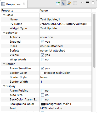
Select a widget to see its properties in the Properties view. The contents of this view adapts to your selection. Click in the Value column to edit a specific property, depending on the type of property this will trigger different behaviour. For example, if the property is just a numeric value, you can edit it in-place (confirm with Enter). If the property represents multiline text or a list of items you will typically have more advanced editing controls in a popup dialog.
Note
Changes are not saved automatically. Remember to select File > Save All before you refresh a runtime OPI.
Depending on the types of involved widgets, it may be possible to batch-edit some properties by selecting multiple different widgets.
Widget Properties
Different widgets have different properties, but many of those properties are shared among them. These include:
- Name
A name that identifies this widget in the Outline view. There is no constraint on uniqueness, but when not specified by the user, Yamcs Studio will try to determine a unique name by concatenating the widget type with a sequential number.
- X, Y, Width, Height
- Widgets are contained in a bounding box which is controlled by these properties.
XandYindicate the pixel position of the widget within the display. The origin is located at the top left of the Editor Area. The X and Y position of the widget also indicates the top left of its bounding box.WidthandHeightindicate the size of the bounding box. Many widgets support automatic scaling within the available bounding box. - PV Name
- The unique name of a PV that will be backing this widget. At runtime the value of this PV will be used to control the intrinsic value of the widget, or to decorate it in case of off-nominal state.If the PV concerns a Yamcs parameter, and Yamcs Studio is connected to Yamcs, you will get autocompletion support on parameter names based on the contents of the Mission Database.
- Alarm Sensitive
Toggles whether or not the bounding box of this widget will be decorated during runtime based on off-nominal values of its connected PV.
- Border Color, Border Style, Border Width
Allows drawing the contours of the widget’s bounding box using a wide variety of different styles.
OPI Properties
The OPI itself is also a special kind of container widget with editable properties. Click on an empty region of your Editor Area to see these.
Specific properties include:
- Show Ruler, Show Grid, Grid Color, Grid Space
Configure the ruler or the grid. Notice that these properties are tied to a specific OPI. The visibility can also be toggled using the toolbar. If the grid is toggled on, the grid lines will work as magnets when positioning widgets.
- Snap to Geometry
When enabled, Yamcs Studio snaps your widgets magnetically in place based on the position of neighbouring widgets.
- Auto Zoom to Fit All
Controls whether the display as a whole should be zoomed in at runtime such that it fits its available space.