
Borders
All widgets can show a border surrounding their bounding box. The border look is controlled by the properties Border Color, Border Width and Border Style.
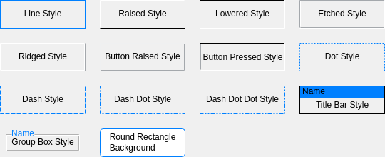
The codes for these borders are:
Code |
Value |
Comment |
|---|---|---|
0 |
None |
|
1 |
Line Style |
|
2 |
Raised Style |
|
3 |
Lowered Style |
|
4 |
Etched Style |
|
5 |
Ridged Style |
|
6 |
Button Raised Style |
|
7 |
Button Pressed Style |
|
8 |
Dot Style |
|
9 |
Dash Style |
|
10 |
Dash Dot Style |
|
11 |
Dash Dot Dot Style |
|
12 |
Title Bar Style |
Title is the value of the Name property.
Title background uses Background Color.
|
13 |
Group Box Style |
Title is the value of the Name property.
Border and title background use Background Color.
Title foreground uses Border Color.
|
14 |
Round Rectangle Background |
Applies Background Color of the widget. |
15 |
Empty Background |
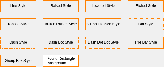
PV-sensitivity
When a widget is backed by a PV, the border transforms depending on the PV state.
- Connected
No decorations
- Connected, but no value (yet)
Dashed pink border around the widget
- Disconnected
Solid pink border around the widget and the label ‘Disconnected’ in the top left corner (space-permitting)
- Expired
Solid pink border around the widget
Alarm-sensitivity
If the widget has the border property Alarm Sensitive set, the border transforms to a 2 pixel wide alarm border when the PV is in alarm state.
- Minor Alarm
Solid orange border around the widget
- Major Alarm
Solid red border around the widget
If the PV is connected to a Yamcs parameter, the mapping is done as follows:
WATCH, WARNING, DISTRESS → MINOR
CRITICAL, SEVERE → MAJOR