
Editor Area
The Editor Area is a unique zone in Yamcs Studio where files are opened for editing. Typically this would be a display file (*.opi), but it doesn’t have to be.
OPI Files
OPI stands for Operator Interface, but is more commonly referred to as a display. OPIs are often static, but when needed can be made very dynamic by combining different widgets and PVs together using concepts like Actions, Rules and Scripts.
In the Display Builder window, create a new OPI file, right-click in the Explorer on the desired location, and select New > OPI File.
OPI files are created with some default properties, which includes a grid, and a size of 800x600. We will see in the section on Properties that we can edit these properties.
Palette
Notice the palette attached to the right of the Editor Area. The Palette contains the widgets bundled with your version of Yamcs Studio. Use the palette as your toolbox when you author a display.
To add a widget to your display, click first on its icon in the Palette, then click where you want to put it in the Editor Area.
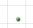
We select as example an LED.
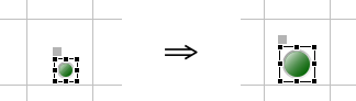
Once the widget has been placed, you can finetune its position and size using the Properties view. Some operations are also readily available in the Editor Area itself using familiar controls. For example, to enlarge a widget, select it, then drag its handles around with the mouse.
You can also move a widget by pressing it, while dragging it to another location.
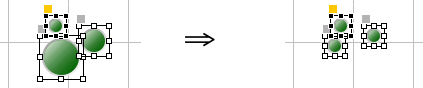
To select multiple widgets, drag a box around them. To add widgets to an existing selection, hold the Ctrl key (Cmd on Mac) while selecting the widgets one by one. Remove a widget from the selection in similar fashion.
Positioning Widgets
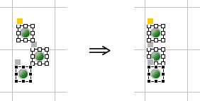
The toolbar of Yamcs Studio contains tools that help us align multiple selected widgets. For example, clicking Align Left repositions these three LEDs to the leftmost position.
There are similar tools for vertical alignments, as well as for distributing horizontal or vertical space between selected widgets.
Match Size
We can also standardize the size of selected widgets. For example. By clicking Match Width and Match Height in sequence, we made these three LEDs the same size.
The size of the last selected widget is taken as the reference. This reference widget is highlighted with black instead of white anchor points.
Note
In this particular case of non-square LEDs, clicking only Match Width would actually have been sufficient since round LEDs can’t take on the shape of an ellipse.